BLACK AND WHITE
This is my first black and white image, I like this image because it has long depth of field and the light and angle creates texture on the locker. I also like the lines through out the whole photo but especially in the background. It's not my favorite image because you can't see the locker number and I don't feel it's perticualrly interesting.
This is my runner up for black and white. I like the subject and the possible story behind it. I think the lockers in the background give it an interesting reverse leading line but the front of the image is very dark and you can't really tell what it is.
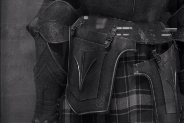
This is my favorite black and white image. I think the subject is interesting and I like how simple the background is behind the busy subject of this knight. I like the angle of the image and I think it works really well in black and white. The only thing I would like to change is the glare from the case the knight was in.
RULE OF THIRDS
This is my first rule of thirds. I like the subject matter and the placement of her. I don't perticualrly like the background or this photo in black and white because the subject came out very dark and hard to see. Though I think it's a nice rule of thirds example.
This is my runner up rule of thirds image. I'm not sure why but I think the bathroom sign is really cool looking and I think the fact that you can see blurred out people in the background makes its more interesting but still keeps the focus on the sign. It also looks like it has three layers to it which is nice.
This is my favorite rule of thirds image because like the first image it has people in it but it's not posed. It's natural and you can read the bathroom pass and sort of understand what's happening. Although the subject is obvious and placed in the left third there's still lots of other interesting things to look at.
MCCALLUM
This is my first McCallum picture. To me it's a causal picture of Mac and if you were to come here and walk down the hall this is what you would see. I like the depth the lockers create and the movement of the people but to me it's a little crooked.
This is my runner up McCallum photo. I really like how you can clearly see the his McCallum shirt and how it's almost the focal point of the photo besides him. I like how blurred the background is but not how bright and reflective is.
This is my favorite McCallum photo. It's a picture of the college admits from the class of 2015. I think this is a really good representation of McCallum because it's the students that have finished high school and now are on to the next chapter of their lives and this was made possible my McCallum. I love the angle of this picture and the 15 and how almost everything is in focus so you can read the information if you want to. The only thing I don't like is the glare are the bottom.


Great job. The images are well-composed and your reflections do an excellent job of articulating the thought process behind the images. 100.
ReplyDelete